The Edible Earth project development
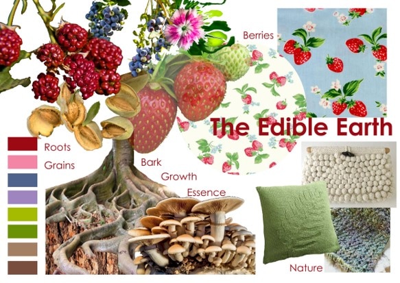
When starting this project, I wanted to choose a literal concept, as my previous projects have been very conceptual. Due to this I chose to look at growth and what the nature provides us, naming it ‘The Edible Earth’. My first concept board included fruits, bark, growth, nuts and grains, roots and the essence of nature. As this concept was so broad, I narrowed down sections within the ‘Edible Earth’ and chose to push my focus towards fruits and segments. My thought for choosing this concept was to allow me to be very experimental with colour, which is something I usually dull down and simplify, but would not be able to do throughout this project.
|
|
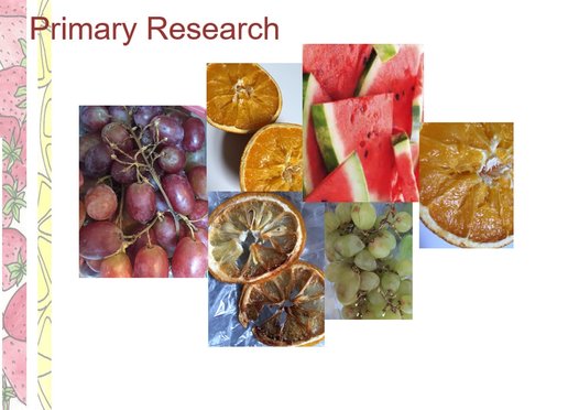
I started off with some primary research by simply going to the shop and buying fruits to cut into and print with. Using the segments of fruits such as limes, lemons and oranges allowed me to look at a more geometric way of working, and taking the simples shapes from other fruits such at watermelon slices, strawberries and berries enabled me to focus more on the colour and placement of simples shapes by looking at repeat patterns and textures.
Colour
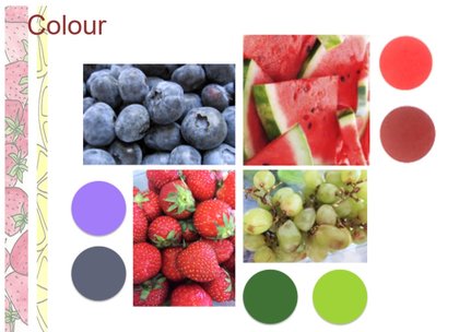
My first concept board consisted on a wide range of colours, which I had to narrow down in order to make my samples look like a sophisticated collection. All my colour choices have come directly through research of fruits and segments. During this research I found that many fruits are vibrant in colour and a lot of them come in a variety of red and greens, which I wanted to make my main colours, as they look moderately wacky and exciting together. Instead of using loads of different colours, I chose to differ the shades and with this, I chose a light tone, and dark tone of both red and greens. Throughout my sample making, I felt the need to add a fifth colour to make my collection more exciting, so I chose a light purple to represent fruits such as blueberries and more exotic fruits such as passion fruit and dragon fruits.
Influence/ market research
I wanted my collection to be a wacky and bright but sophisticated collection that would be within the high end market. Whilst doing my research, I found that most high end stores sell interiors that are more refined and not as bright in colour as my collection, so did not really think that my cushions would fit in place. Therefore I looked at more of the ‘middle class’ shops such as Next and Cath Kidson. Although Next is a very mainstream company, I saw a relationship between my work and some of there geometric brightly coloured collections. Cath Kidson was an obvious choice with their use of fruits and bright colours, so I believe that my collection would fit perfectly within their shop. However my cushions are more for show than practicality of use, some of the techniques that I have used has made the feel of my cushions not necessarily appropriate for comfort, and are extremely delicate.
I also started looking at artist painting and understandings of the simple topic that is ‘Fruit, from this I looked at Matisse painting of the ‘fruit bowl’ and Van Gogh’s interpretation which is much more 3d in relation to Matisse’s flat version. From this I decided to differ between 3d and flat knits to create an obvious contrast that would sit well within my cushions.
Most of my visual research is made up of repeat patterns and exploring shapes and colours within ‘the edible earth’. From my visual research I interpreted this into my knits focusing on forms, outlines and textures.
Process/techniques/materials/ final
I wanted my final samples to be made up of 4 collective cushions, however I pushed myself and managed to create 6. Using only the fine gauge domestic knitting machine, I was able to base my collection on partial knitting, in contrast to some more geometric and 3d knitting techniques. Intertwining the two shades of reds and greens together created a gradient strip effect which I carried through into all my samples so they did not look too flat and to provide a grainy effect relating back to the segments within fruits as no fruit is one solid colour.
One thing I would like to change about my samples if I had time, I would have liked to embroid onto them to give them more depth and a glimpse of shimmer to express the shiny quality of some of the fruits surfaces.
Making my finals into actual products helped me to visualise the end use a lot more. The placement I had envisaged for my collection of cushions was in a simple room on a plain sofa to enable the cushions to pop through and brighten up with room with character and classiness. I’m extremely proud of my final samples, and in my opinion they look like a sophisticated collection, which can be related to my concept of ‘The Edible Earth’.
Today I have chosen to display my cushions in baskets to give the market fruit rustic vibe to add a bit more character to my collection.
Colour
My first concept board consisted on a wide range of colours, which I had to narrow down in order to make my samples look like a sophisticated collection. All my colour choices have come directly through research of fruits and segments. During this research I found that many fruits are vibrant in colour and a lot of them come in a variety of red and greens, which I wanted to make my main colours, as they look moderately wacky and exciting together. Instead of using loads of different colours, I chose to differ the shades and with this, I chose a light tone, and dark tone of both red and greens. Throughout my sample making, I felt the need to add a fifth colour to make my collection more exciting, so I chose a light purple to represent fruits such as blueberries and more exotic fruits such as passion fruit and dragon fruits.
Influence/ market research
I wanted my collection to be a wacky and bright but sophisticated collection that would be within the high end market. Whilst doing my research, I found that most high end stores sell interiors that are more refined and not as bright in colour as my collection, so did not really think that my cushions would fit in place. Therefore I looked at more of the ‘middle class’ shops such as Next and Cath Kidson. Although Next is a very mainstream company, I saw a relationship between my work and some of there geometric brightly coloured collections. Cath Kidson was an obvious choice with their use of fruits and bright colours, so I believe that my collection would fit perfectly within their shop. However my cushions are more for show than practicality of use, some of the techniques that I have used has made the feel of my cushions not necessarily appropriate for comfort, and are extremely delicate.
I also started looking at artist painting and understandings of the simple topic that is ‘Fruit, from this I looked at Matisse painting of the ‘fruit bowl’ and Van Gogh’s interpretation which is much more 3d in relation to Matisse’s flat version. From this I decided to differ between 3d and flat knits to create an obvious contrast that would sit well within my cushions.
Most of my visual research is made up of repeat patterns and exploring shapes and colours within ‘the edible earth’. From my visual research I interpreted this into my knits focusing on forms, outlines and textures.
Process/techniques/materials/ final
I wanted my final samples to be made up of 4 collective cushions, however I pushed myself and managed to create 6. Using only the fine gauge domestic knitting machine, I was able to base my collection on partial knitting, in contrast to some more geometric and 3d knitting techniques. Intertwining the two shades of reds and greens together created a gradient strip effect which I carried through into all my samples so they did not look too flat and to provide a grainy effect relating back to the segments within fruits as no fruit is one solid colour.
One thing I would like to change about my samples if I had time, I would have liked to embroid onto them to give them more depth and a glimpse of shimmer to express the shiny quality of some of the fruits surfaces.
Making my finals into actual products helped me to visualise the end use a lot more. The placement I had envisaged for my collection of cushions was in a simple room on a plain sofa to enable the cushions to pop through and brighten up with room with character and classiness. I’m extremely proud of my final samples, and in my opinion they look like a sophisticated collection, which can be related to my concept of ‘The Edible Earth’.
Today I have chosen to display my cushions in baskets to give the market fruit rustic vibe to add a bit more character to my collection.
